For most developers and designers, apps for smart TVs are one big mystery. Discussion forums are empty and everyone is keeping their know-how a secret. Paving the way was not easy but we managed! And now, we’ll show you how to go about it.
How to develop apps for a smart TV while trying not to cry (1/3)
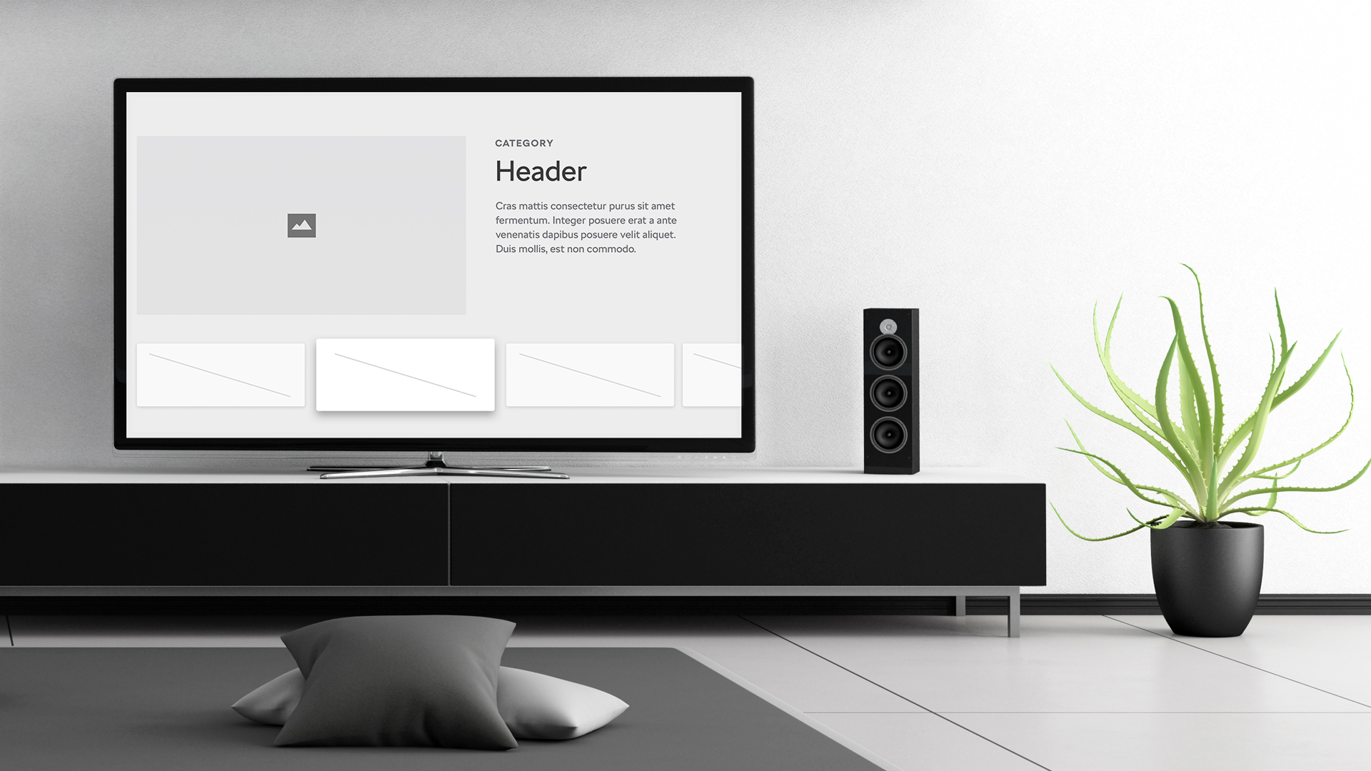
The following series will present how to tackle the UX/UI design as well as the actual development of apps for smart TVs. While developing the app, we also considered the higher principles and topics. We wanted the app to run on TVs with TizenTV and webOS operating systems.
We aimed for an app with fast response times as most TVs are quite slow. And we also recognized that the app has to have an understandable UI and has to be controlled via the cursor as well as the pointer. And last but not least, it has to look good.
Part 1: UX/UI design for smart TV
Most of the graphic design online deals with websites and mobile apps. Over the years, we had the chance to learn the basic principles and we know the recommendations and the differences of various platforms. When a new touch screen size is released on any device, we “only” apply the same principles for a different resolution and it works. Take the launch of the iPhone X as an example.
Things are different when it comes to the smart TV.
Screen
The days of the first PlayStation and us sitting half a meter from our CRT screen are long gone. You have to realize that the user is watching your app from a distance of around three meters and is usually in a horizontal position. You can say that the software you are developing is intended for relaxation, at least to some extent. And you have to keep that in mind.
For this project, we worked with a 1280 x 720 HD resolution, taking into account the size of the .sketch file. Of course you can use FullHD or 4K if you want but don’t forget to multiply our recommended dimensions accordingly.
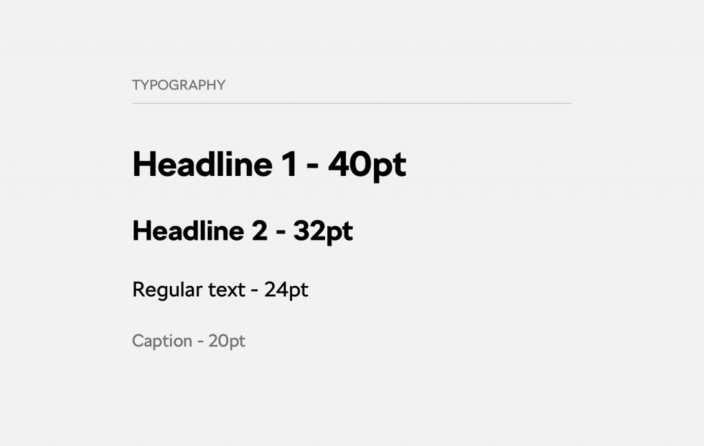
We found these font sizes to be the best for UI testing on a TV:
Sufficient contrast
In general, designers don’t like contrast very much. We can see that from any graphic design portfolio. You won’t get away with that when developing for TVs. Every design that you show on the TV has to be tested in every screen mode the TV offers (game, movie etc.).
It’s because each mode is different and changes the visual setting of your design a lot. If a design looks great in movie mode, it might look terrible in eco mode. The same holds true for modes that automatically adjust the brightness of the TV. You can test the contrast in this handy Jxnblk tool for example.
Focus state
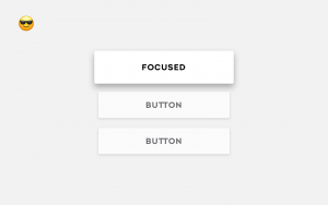
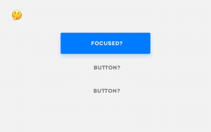
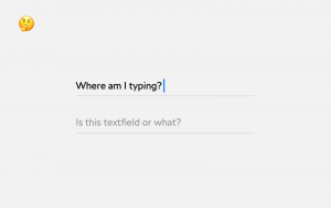
The controls used for TV do not differ a lot from the ones used for web or mobile. A button, text field, validation, popups and so on always come in handy. But you have to keep in mind one important thing: users must know where they are on every single screen and what element can be selected using the remote control. Therefore we’ll define a so called focus state for each element.
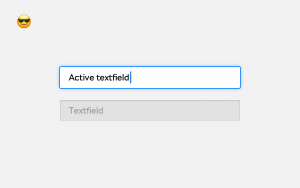
It might look trivial but forget about looking online for inspiration. The same rule applies to the other elements, such as a text field.
Navigation around the app
The biggest challenge is how to put it all together so it works. Why?
- You have to account for a physical remote control that only moves in four directions.
- You also have to account for a remote control which works as a pointer (e.g. LG Magic Remote), making it as if a computer mouse was connected to the TV.
- It’s possible to connect numerous other peripherals to the TV, such as a keyboard or Xbox.
- And there is also this large, empty space on the screen that needs to be filled.
Where do we start?
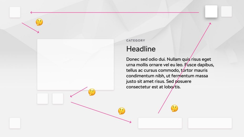
The biggest restriction is the possibility of movement in only four directions, so let’s start with that. The whole layout has to be predictable. Users have to know where they’ll end up after pressing the DOWN button followed by the RIGHT button.
If a remote control that works as a pointer is used, the movement won’t be right-angled. But we’ll achieve a similar result using the focus state and thus we’ll get directly to the specific element.
Why is this important to adhere to?
There is no four-direction movement on the web or on a smartphone. Users just tap the required element on the screen or use a mouse to get to it. This is not possible when using a classical remote control.
Imagine a layout that would work in, let’s say, a drastically improved version of a tablet. For Smart TV users it’s almost impossible to know in which direction they’ll move when controlling the app with a standard remote control.
Different standards between platforms
Try to tailor your app as much as possible to the intended OS. You’ll make the life of developers and users much easier.
The most popular operating systems at the moment are:
Generally, Samsung and LG present designers with a set of UX recommendations on how to create an app, similarly as we did in this article. Apple and Google also offer specific UI components that a design should have.
The next article will be written by my colleague Petr who will focus on the specifics of Smart TV app development. If you have any questions, post them in the comments below and I’ll do my best to answer.
