The difference between a mobile app and an app for a smart TV is huge. This article will present the life of a smart TV user. We’ll focus on their comfort while navigating through the app. Find out how to define the navigation around the app and what features cannot be missed.
How to develop apps for a smart TV while trying not to cry (2/3)

In the previous article Jakub Hoffman described the principles for creating navigation elements from the design perspective. I will tackle this issue while keeping in mind comfortable navigation around the TV app.
Part 2: Introduction and suggestions for the design of the control for the smart TV app
TV world vs. mobile world
The mobile world is full of people of all ages and various backgrounds that need quick access to information. Social media, news, public transport timetables… We need access to everything immediately in a form that presents only the important bits.
The world of users sitting in front of a TV screen is different. Impersonal, quite random. In this world there is no way to have personal contact with the device that is three meters away from you. A smart TV can do quite a lot. Its creators packed it with a plethora of useful apps and functions. But users sitting in front of the screen are holding a remote control that, unfortunately, has not been redesigned in decades.
This results in the work with the smart TV being dull, clumsy, and slow, and the user-comfort level is virtually non-existent. Usually we turn to TV apps only as a last resort, because we have no other choice. If we can, we always prefer to use a mobile device. Playing a YouTube video using “only” four control arrows on the TV remote and typing the name of the requested video on a virtual keyboard is an unpleasant experience that we want to avoid for the rest of our lives after the first experience.
Comfortable control as a feature
You need to introduce an app that will eliminate this experience from this world full of lazy couch potatoes ready to smite you down with their negative comments. If you want to succeed, you have to offer user-comfort as your main feature. What is natural and normal in the mobile (and internet) world is very hard to design and implement in the Smart TV world.
The basic principle for TV controls is that there always has to be one active element on the screen. You can’t just start from anywhere, as you can on mobile or in a web browser. There has to be a starting point and the “path” users can take has to unfold from this point.
There are two basic responses to the touch of a button:
- movement on the screen (highlighting of the next element) or return to the previous screen
- starting the active element’s action (playing a video, movement to the next screen…)
While the movement on the screen has to be fast, the action has to be understandable. In other words; you have to find what you’re looking for in the least amount of time. On the other hand, pressing the button (play a video) can run a short animation, resulting in even a stronger feeling from the interaction while at the same time confirming that the requested action follows.
If we teach users these principles on the first screen, we don’t have to explain these later on. Users will be able to focus on the app itself.
During the development process, the keydown() method proved useful for movement on the screen, as well as binding the keyup() method to the press of a button. Keydown responds immediately, keyup only when the button moves up (and the button can, for example, have a button press animation using the CSS).
How to define the navigation around the app as the developer
The control guidelines for TizenTV, webOS and all other web-based TV systems mutually agree on one recommendation: Be smart when developing an app and its controls. That doesn’t say much else than that it’s all up to you and you have to figure out everything on your own and tailor it to your specific needs. When you get over the feeling of loneliness in this brand new world where no one’ll help you, you’ll start checking discussion forums in order to try and gather the best practices for a given platform there. But alas, the message boards are also a lonely place to be, almost as if no one has ever developed anything for a TV. You’re still in this alone… And the help isn’t coming 🙂
A few days of trial and error with your prototypes will make one thing clear: There is no such thing as a “smart map” of elements that you have defined on the screen and that you can magically move between by pressing a cursor arrow as if the TV would know how everything is arranged. The TV doesn’t know, it’s not smart, it’s still dumb for now… And to make it smart, you need to teach it something.
In this case, it means that you have to define everything that should happen after pressing any of the allowed remote control buttons on any of the active elements on the screen. Piece of cake. But as you might have expected, there’s a catch. Sometimes it doesn’t hold true and you have to remember the path that the users took and lead them back in a logical way, if they choose to do so. So here you can see why the Be smart recommendation is very useful.
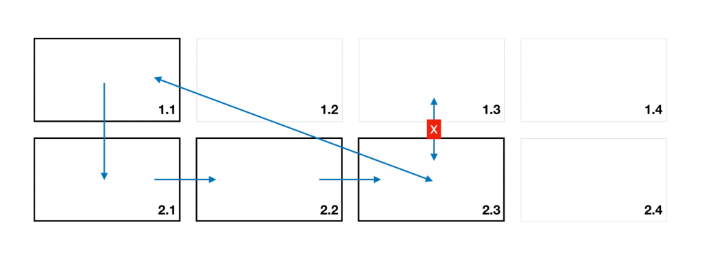
The rule of the visually closest element applies to the first scenario, where you don’t have to remember anything. If there is a button under the currently active element and you press the down arrow, you logically have to end on the button below.
A nice example of the second scenario is multi-level navigation: If you are on the first element of the upper navigation (1.1), pressing the down arrow will unwrap the bottom navigation (2.1), taking two steps right will select the third element on the same level (2.3) The up arrow will not take you back to the closest upper element (1.3) but to element 1.1 because that was your starting point. Likewise, the down arrow will not get you to 2.1 (as in the first example) but to 2.3 because, again, that was your starting point.
The Back button has its own story. You can regard it as sort of an ESC button. Sometimes it closes something (usually a popup), sometimes it takes you one step back, but usually it takes you somewhere completely different. In this case “Be smart” is even more important. The use of the Back button cannot be generalized, it requires a separate thought process for each and every screen/scenario. It is the most important button of all because it’s the first button that users press when they encounter problems or perform an action they didn’t want to do. The Back button has to perform an action that is the most logical in that situation.
But the most logical action for you doesn’t have to be the one your average users think of. Considering the target group, there probably is not a device that would require more user testing. Anyone who can use a TV remote control and has no technical background is your potential user (so basically everyone). That’s why it’s necessary to ask your colleague/family member or, ideally, someone you don’t even know to do a test for you every time you implement a new navigation action. Give them the remote, don’t tell them anything, and just observe how they work with the app and what behaviour they expect from the app. That’ll be your know-how for any subsequent development and will allow you to go in the right direction.
The last article of this series will deal with the app’s architecture. We’ll also share with you some fun moments we had during the development of the app for Smart TVs.

